Stata offers many options to graph certain statistics (e.g. dot charts). These options, however, do not always work well to compare statistics between groups. To address this, I am sharing a program called plotmean, which allows users to graph the mean and confidence interval of a variable across multiple groups.
Running this do-file will generate the following graph:
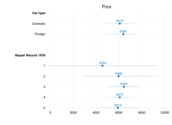
The program relies on the statsby function and can be easily modified to plot all sorts of statistics.